Box Shadow Generator
Tune a two layer box shadow with a live preview and copyable CSS
How to use
- Start from a preset close to your goal, then fine tune field by field.
- Adjust layer one's offset, blur, spread, color and opacity. The preview card updates live.
- Keep layer two enabled for depth. Both layers stay independent, and unticking returns to one.
- Tick inset to build recessed panels and pressed effects.
- Copy the standard box shadow declaration and paste it into any element style.
Usage and syntax
Is the generated code standard CSS?
What does the spread radius do?
When should I use inset shadows?
How do two layers stack?
Common questions
The preview works but nothing shows on my page?
Does the shadow color have to be black?
Are my parameters saved?
Does a shadow affect layout?
Screenshots
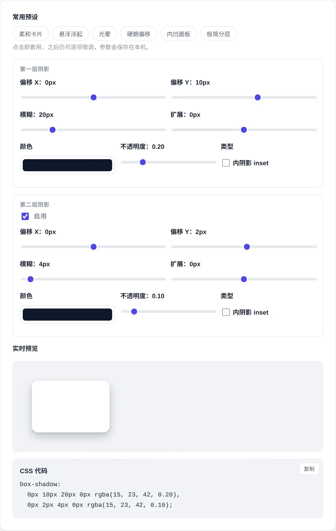
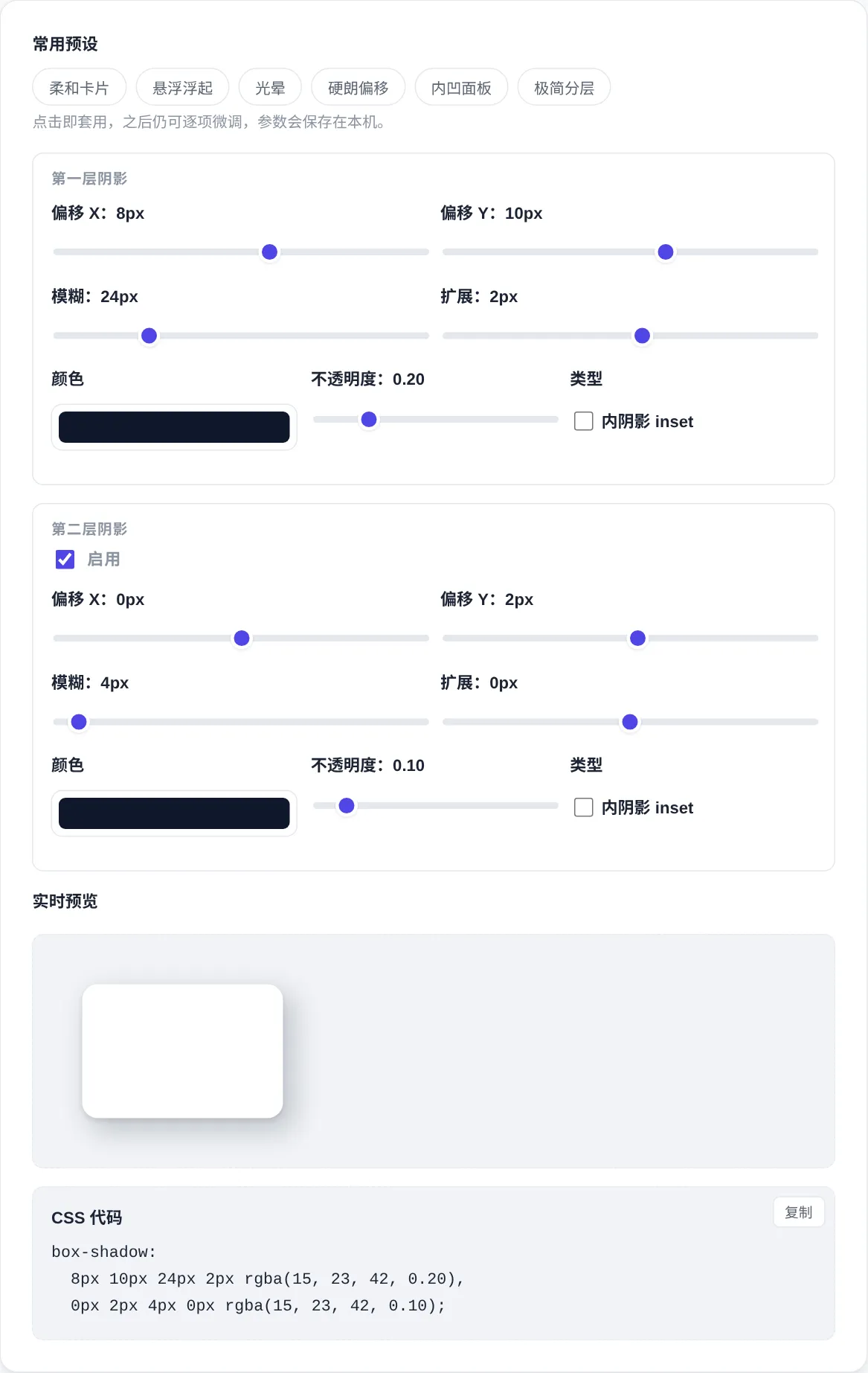
How to use
- Start from a preset
Six presets cover cards, overlays, glows and inset panels. Pick the closest one and fine tune from there, which saves trial and error.
- Tune the first layer
Offset sets direction, blur sets softness, spread grows or shrinks the shadow, and color with opacity sets the weight.
- Stack the second layer
A second layer pairs a soft ambient pass with a tight contact shadow. Both layers stay independent, and unticking returns to one.
- Copy the CSS
The output builds a standard box shadow rule in real time, comma separated for two layers. Copy it into any element style to apply.
About this tool
Shadows are the main way interfaces express depth. Overlays, cards and pressed states all rely on them to show height. A box shadow rule combines a horizontal offset, a vertical offset, a blur radius, a spread radius, a color and the inset keyword. The first two set direction. Blur sets soft or hard edges, spread grows or shrinks the whole shadow, and inset flips it to the inside. Any color works, and lowering opacity usually looks more natural than pure black, a detail beginners often miss.
This tool splits two shadow layers into independent controls. Sliders and color pickers update the preview card as you drag. Six presets cover common pairings and stay editable afterwards, with the matching one highlighted. The output builds a standard box shadow declaration, comma separated across lines when both layers are on, ready to copy and paste. Everything renders locally in the browser, parameters persist on this device, and the next visit picks up where you stopped.
How it works
Box shadows do not take layout space. They paint outside the border box, or inside it with inset, and they follow the element's rounded corners. The first declared layer paints on top, and further layers stack below. The blur radius is twice the standard deviation of the blur, and spread resizes the shadow before the blur applies. Negative offsets move the shadow the other way. Knowing the declaration order and the clipping rules explains most cases where a shadow seems missing. The cause is usually a clipped parent rather than wrong syntax.
From a design view, natural light usually needs two passes. A tight layer hugs the edge like ambient occlusion, and a wide faint layer plays the cast shadow. A deep gray with a slight blue lean beats pure black on light backgrounds. Dark interfaces get little from shadows, so brighter borders or background lightness carry the hierarchy instead. Very large low opacity blurs cost render time on weak devices. Animating shadow values directly can drop frames, so prefer opacity transitions for motion.
When to use it
- Cards and overlays
List cards stay light with a small offset and low opacity. Dialogs and menus get a larger offset and blur to float. Keep two or three elevation levels across a product, and the shadow depth itself tells users which interactions weigh more.
- Pressed button states
On press, shrink the shadow and nudge the element down a pixel or two to sell the push, then restore on release. The eye reads the change as depth, not as decoration. Adding a subtle inset shadow imitates a physical key sinking in, giving clear feedback without noise.
- Inset inputs
Form fields with an inset shadow and a light border read as recessed containers. A heavier shadow at the top edge and a lighter one below matches how light falls. Switching the border color on focus makes the state change obvious.
Tips & tricks
- Skip pure black. A dark gray with a hint of the page tone at lower opacity reads more natural.
- Pair two layers on cards: a tight one near the edge plus a wide, faint one for depth.
- Leave room for the shadow, since a parent with overflow hidden will clip it away.
Things to watch
- Clipped by a parent
A parent with overflow hidden clips the child's shadow, which looks like the style never applied. List containers trigger this most often. Give the parent padding or move the element into an unclipped container so the shadow has room to paint.
- Too heavy a shadow
A large opaque black shadow makes pages look dirty and crushes the content hierarchy, so users read the interface as heavy. Drop opacity below twenty percent and recheck the result. Most cards never need more than forty, and lighter almost always wins.
- Overusing blur
Hundred pixel blurs on small widgets look smudged and cost render time, and weak devices can drop frames while scrolling. Match the shadow scale to the element. Small radii suit small parts, and only large panels deserve the big radii.