Glassmorphism Generator
Tune blur, saturation and gradients to build frosted glass cards
How to use
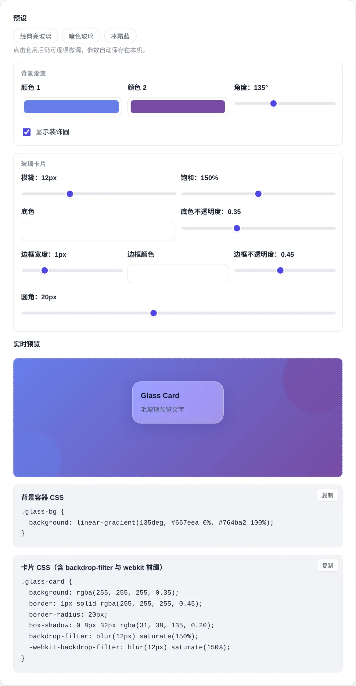
- Tune the background first: two gradient colors plus the angle set the backdrop, and circles add color movement.
- Then tune the card: blur sets the frost level and saturation brightens what shows through.
- The tint opacity balances transparency against stability. Raise it when text goes soft.
- Border width, color and alpha adjust separately, and the radius follows your overall style.
- Copy both snippets, backdrop and card, and paste them into a page to reproduce the preview.
Properties and support
How well is backdrop-filter supported?
How is backdrop-filter different from filter?
Why does my page show no glass effect?
What if the text is hard to read?
Common questions
What about performance?
Are the parameters saved?
Does glass work on dark interfaces?
Do the circles need CSS too?
Screenshots
How to use
- Tune the background
Two gradient colors and the angle set the page backdrop. Decorative circles in the same family stack behind the card and give the blur something to show.
- Tune the glass
Blur sets the frost level, saturation brightens what shows through, and the tint alpha balances transparency against readable text.
- Set border and radius
A translucent white border is the signature of the style. Adjust width and alpha slightly, then match the radius to your system.
- Copy both snippets
One rule styles the backdrop and one styles the card. The backdrop-filter line ships with its webkit prefix already in place.
About this tool
Frosted glass relies on backdrop-filter: the browser applies a blur and a saturation filter to whatever sits behind the element. A translucent tint layers on top, and the colors and shapes of the background show through. It differs from filter, which acts on the element itself, while backdrop-filter acts on the content behind it. A white hairline border and a soft shadow complete the signature look. The border outlines the card on light backdrops and the shadow lifts it off the page. The tint opacity sets how much comes through: too thin smears text, too dense loses the glass.
This tool splits the scene into a backdrop and a card. Two gradient colors plus an angle build the background, and two decorative circles create color movement. Blur, saturation, tint alpha, border and radius stay independent for the card. Two CSS snippets come out: one for the backdrop container and one for the glass card, with the webkit prefix included. Paste both into a page to reproduce the preview. Three presets cover light, dark and frost styles, parameters persist on this device, and everything renders locally.
How it works
Backdrop-filter takes the area behind an element as its input and applies a gaussian blur plus a saturation shift, which costs more than ordinary compositing. Large surfaces or many blurred elements slow scrolling on weak devices. Safari requires the webkit prefixed form, and the output carries both the standard and the prefixed line. Browsers without support ignore the property and the card degrades to a plain translucent tint, so the layout survives and the fallback stays calm. Bigger radii cost more, and 20 pixels is a common balance between look and speed.
The style peaked alongside modern system interfaces around 2020, built on layering, transparency and light. Watch contrast first: text needs a clear lightness gap from the backdrop, and low alpha over busy images turns chaotic. Prefer static regions for heavy blur, keep large blurs out of scrolling lists, and swap list cards to plain translucent tints. Dark and light recipes differ. Dark themes lean on brighter borders and lower tint alpha, while light themes lean on white borders and soft shadows.
When to use it
- Sign in and modals
Sign in cards and modals suit glass well. The page keeps its colors behind, while the translucent layer pulls focus to the form. Blur pushes the background into the distance, and a white border draws the card outline cleanly. The combination reads calm even over busy illustrations.
- Dashboard tiles
Dashboard tiles share one glass recipe over a gradient with decorative circles. Borders and shadows separate the tiles from each other. Raise the saturation a little and chart colors glow through the tint, keeping the whole board modern, uniform and easy to scan.
- Mobile overlays
Bottom sheets, floating buttons and top bars match system styling with glass. Mobile budgets are tight, so keep blur under 20 pixels and avoid full screen blurs. Reserve the effect for small floating layers to protect frames and battery life.
Tips & tricks
- Put a rich gradient or color blocks behind the card, since a plain white backdrop shows no glass at all.
- When text goes soft, raise the tint opacity or darken the tint. Readability beats transparency.
- On dark interfaces use a dark tint with lower alpha and a brighter border instead of the white recipe.
Things to watch
- A plain backdrop
On a white or single color background the blur has nothing to change, so no glass appears. The effect lives on the color and shape behind the card. Lay a gradient or color blocks first, add the circles, and the card finally has something to refract.
- Blurring everything
Backdrop-filter recomputes every frame, and blurring each card in a long list drops frames fast, worst on weak phones. Cap the radius and limit the count. Swap list cards to plain translucent tints and keep true blur for static regions.
- Failing contrast
Too little tint alpha lets text blend into the backdrop and readability collapses, worst with small type. Lift the tint past forty percent or match the tint darkness to the text color. Dark text pairs with light tints and light text with dark ones.